Monday, January 30, 2012

Weekly Challenges

I spent the better part of the day playing to get my entries ready for Texture Tuesday and Photo Art Friday.
Started with this image
I took the time to try out a lot of new filters, work with Topaz Adjust and my new plug-in.....Photo Essentials 4.  I don't know if it's my computer or the Photo Essentials that is having a problem.  My Mac just seemed to get hung up and I would have to wait for the spinning beach ball.  I just added more RAM, but it acts as if it need more.  Computers..........arghhh!!!!


added this image


and this one


to get this


From here I added Kim Klassen's "Simplicity" texture and got this result
I liked the change in colors I achieved by using the difference blend mode.
I added Pixel Dust Photo's "Happy Day" texture
for another result

I then added Nick Fortune's "Green 1" overlay and switched PDPA's "Happy Day" to "Dream" overlay and played with various filters  
 I used a tile filter here
and used poster edge filter for this


The possibilities are endless.  There are so many other ways to edit.  Sadly Picnik is going away, and it was my go-to for fun additions. I haven't used the Actions I have for a while so perhaps I'll play with them next time.

Linking to: kimklassencafe andPhoto Art Friday


Saturday, January 28, 2012

Life with Anna

Anna, our new whippet adoptee, has been with us a week now.  She is a few months shy of her second birthday.  The breeder's hobby is coursing (chasing a lure which is a plastic bag on a sort of a conveyor belt).  She was not a good choice for the sport evidently and we were able to adopt her.
  It's been many years since I've had a dog this young.  Even though she is "full grown" physically, she is still a puppy mentally.  As someone once said to me, "they don't get the wiggles out until they're three years old".  Anna is no exception.  She has a wonderful curiosity.....she wants to inspect everything.
  She is easily distracted by all the new things in her life.  So far she has only had one accident in the house....that was in the kitchen the first day we had her.  Of course, she has us well trained......we let her out quite a bit and she seems to be getting the hang of relieving herself outside. 
My husband who has trained sighthounds for years says she needs "shaping".  Just getting her to walk straight and not pull on the lead is the first major shaping she is getting.
The first day I had her to myself my handyman came by to take care of some things in the house and I was a little distracted.  In that time she:
1. Jumped the baby gate
2. Knocked over my coffee on the counter
3. Knocked over my dish with two vitamins in it.  Probably ate the vitamins.
4. Jumped up on Mike's bird cage on the patio.  (She is obsessed with both bird cages, so I can see that's going to be a problem)
5. Jumped over the open dutch door.  In my trying to catch her, I fell and hit my head on the wood siding on the garage.
I can see I'm going to have to crate her when I can't supervise her every move.
Ahh, life with a puppy...............
Getting a decent photo of her is a challenge as she can't be still long enough.
She is so cute and loving, it's hard to get upset with her.  She just needs to grow up a bit.


Friday, January 27, 2012

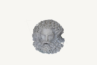
North Pole God

For Photo Art Friday I started with four images and then layered with textures.  The final edits are shown here


The original images are shown here


I used Pixel Dust Photo's "chinks of light" and "tangled tendrils", various blend modes and filters to achieve the different looks.  The abstract results are so fun because they look nothing like the original images.  I like the various plays of color depending on textures used and blend modes.
Here's a sample of my workspace.
Have a great week and stop by to see the other works here.  


Photo Art Friday

Thursday, January 19, 2012

Fancy Pencils

Our challenge this week for Photo Art Friday is to use any two of Pixel Dust's textures.
I just looked after I finished this post and I think I was supposed to do an abstract piece with these textures.  Just pretend this is an abstract!
If you roll your mouse across you can see the original. 

I've used two of Bonnie's newest textures -- "chinks of light" and "off kilter" on my image.
The "frame it layer" is making use of my new  "On One Essentials" plug-in for additional editing.  It's a little like the plug-ins that are so popular right now -- Topaz, etc.  I chose this frame from a library of hundreds.  You can also do many other edits with this plug-in.  If you go to their site, you can look at the various types of edits you get, and you can also get a free trial right now on most of their products.
Also Layer 1 is what I would call "stamp visible".  It's a composite of everything that has been done and is non-destructive.  It can be removed if I want to try something else.  You can get the "stamp visible" layer by selecting shift alt/option command E - neat trick!
I'm linking to:


Photo Art Friday
Stop in and take a look at the artistic efforts of many others by clicking on the badge above.
Have a fun week!


Saturday, January 14, 2012

Faces in Collage

I'm presently taking Sharon's (All NoraS Art) Faces in Collage class.  I finally completed my first one.   Sharon has great video instructions.  I could watch her paint all day.  She makes it seem so effortless!   I'm so taken with faces....I've played a lot with them but never felt very good at them.  This class gives me a chance to play with the face already in place.  I just get to redecorate it.  It's really a challenge to get the values/shadows right and sometimes I find my paint has dried on my palette while I'm working.  Then I have a problem getting the right color mix again.  Oh well......practice, practice!
Original glue down before painting
and the redecorated version
She reminds me of the Avatar woman even though she is not blue.


Thursday, January 12, 2012

I'm Late, I'm Late for a Very Important Date!!

I almost did not get my entry done for Photo Art Friday.
 I'm having a hard time with re-entry after the holidays. 
 Thank goodness Bonnie at Pixel Dust Photo Art was kind enough to share her lovely 
"faded fresco" texture with us. I used it with an photo I took of 
Xavier del Bac Mission outside of Tucson, AZ. Though I like it with the linear light blend I really liked the difference blend which gave it some wonderful color.  If you go to Bonnie's blog, she gives instructions on how to make a border (as I did in the bottom photo) using your crop tool. Thanks, Bonnie!
Linear Light
Difference

Sharing with
Photo Art Friday

Sunday, January 08, 2012

Abstract Play

I'm having so much fun with Bonnie's abstract textures.  This one is called "Abstract Elements Drops of Jupiter".  I put several photos together with different blend modes and then flattened the image and added this texture.
These are the photo elements I used


You can find her tutorial on her blog here.  She is very generous with free textures, but I plan to purchase her abstract set. 
Hope you are all enjoying the new year.


Thursday, January 05, 2012

Shooting Star

It's a new year and I have high hopes for a great year!!!  I used one of Bonnie's abstract textures and played with blending modes per her instructions.  I did several but this was my favorite.
I also added one of my custom brushes.
Have a look at the other samples by clicking on the button below.
Linking to


Photo Art Friday