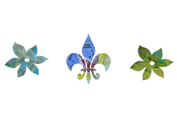
Okay, then, I have worked on this header for two hours plus. I tried making it shorter, butit did not look good that way. Each time I had to do major manipulations of the template. But I've
settled on the one I'm using. Here's another example.
I've looked at fonts until my eyes are popping out. Eke!!!!
I reworked my "About Me" and added a "mission". I think I'm done for now.


11 comments:
Sooooo sweet! I LOVE your new header!! Really nice job. ;->
Just LOVE your new header, gorgeous!
Great work, see you in class!
Marie
WOW you have been busy! And creating your own header I'm inspired.
I get such enjoyment out of seeing how much fun you are having Marilyn.
Go go go!
I love your shades of green, it is lovely. I love looking at fonts but after awhile it does make your eyes pop! : )
Love the new header!! well done on all your hard work, I need to do a new portrait, dreading that!
I like your blog header. It is a true reflection of you and your mission.
It looks great!Love it all!
Lee
I like the one you used. Love your 'art' (BTS) Roxi
The colors are very "happy" (if colors can be happy!) Nice to have a mission statement too.
love your header
xoxo
Very nice header. and I would love to make some brushes as in the post above.
Post a Comment